Media arts internship February 18, 2015

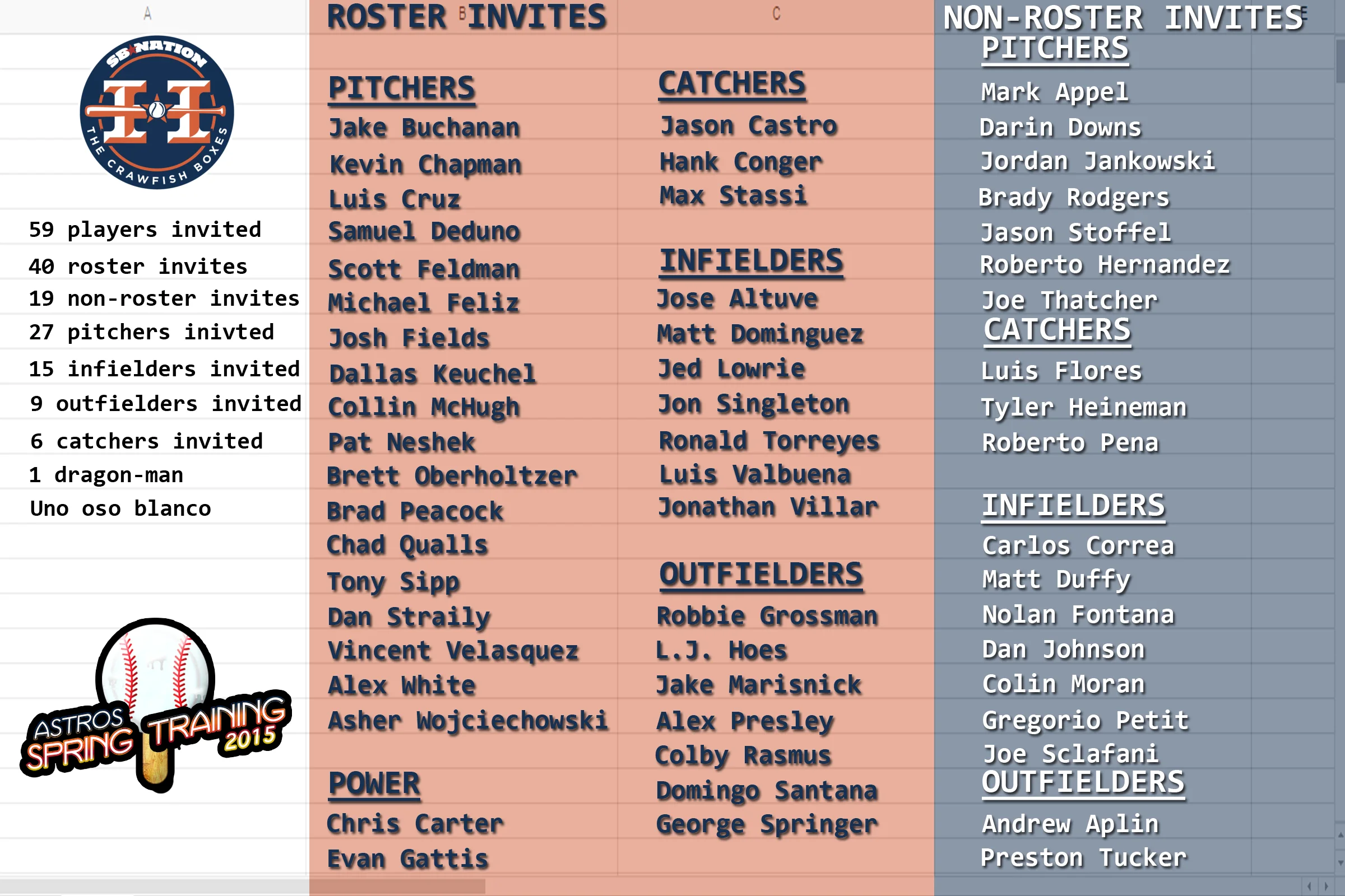
Ryan our graphics designed decided to go ahead and make a graphic for the March Madness logo. I decided that we needed to keep some consistency with the logo so I took out the words and site logo on the one I created and added the word part of his graphic to my background. He really does an excellent job so it only improves upon my graphic, which is fine with me. He also made a generic logo for Spring Training. I took that logo and added it to the bottom left corner of my Spring Training Roster infographic. Here’s what we’ve got for logos now:

I was also asked to make some GIFs for a future article. This is what I made:

Colby Rasmus home run vs. Edison Volquez

Colby Rasmus home run vs. Ubaldo Jimenez

Colby Rasmus home run vs. Ubaldo Jimenez take 2

Colby Rasmus home run vs Gerritt Cole

I’m really starting to like the jump cuts to different angles. I used to do just a single swing, but I think these are better for analysis and make the GIFs more interesting to watch.

Media arts internship February 16, 2015

I edited the podcast we recorded last night and created the post for the episode, which is scheduled for its typical Tuesday morning release. I also started prep for next week’s episode. Today Baseball Prospectus came out with its organizational rankings and the Astros were farther down on the list than most of us expected, which makes for some potentially good content on the next recording. I also had to schedule another co-host because one of mine wasn’t sure if he would be able to make it next Sunday.

I then created and scheduled the post for Friday for our Spring Training infographic. Then I began work on refreshing a graphic for our minor league content. Here’s what we had as just a general graphic for use:

I created this graphic a few years ago so it’s due for a remake. I’d like to keep the bus, but I might have to ditch it entirely. I really like what I’m doing with backgrounds of the images I’m creating, but I think the letters and the display of those letters needs to be better. I’m going to see if I can improve that for my next graphic. The infographics seem to be coming together nicely so far; the graphics on the other hand are a bit frustrating to work with.

Media arts internship February 15, 2015

I created the post for our live recording and then worked on the shownotes for the show. I typically take an hour prior to going live to refine the show notes, then we record for about an hour. I usually try to keep it under an hour. After saving the show I got feedback from my co-hosts on the graphics I was doing. I went ahead and created the matchup logo that we will use for the March Madness tournament.


Media arts internship February 14, 2015

I finished the March Madness logo. It still probably looks like it was done in PowerPoint, but I added some texture to the words. I went outside and took several pictures of balls that we have as memorabilia. I wanted to include grass because I think it makes a great texture.

I finished the March Madness logo. It still probably looks like it was done in PowerPoint, but I added some texture to the words. I went outside and took several pictures of balls that we have as memorabilia. I wanted to include grass because I think it makes a great texture. Here's the final version:

The Astros recently added another veteran player to their Spring Training roster so I had to update the Spring Training roster infographic again. I also worked on the podcast notes for Sunday nights show.

Media arts internship February 13, 2015

I continued work on the March Madness logo, which I was told looked liked it was created in PowerPoint and was demonstrated to me. So I went back to work trying to un-PowerPoint it. I was given a few sites to review for ideas and I decided to do a little research on Pattern Overlays and textures. Before I did all that though I decided to split up the text and I added a cutout filter to the image behind it to give it a more artistic look. I also added a gradient overlay to the background using the sites blue and orange colors. I then decided to give the word, “madness” a different font and give it a gradient separate from the other words. Here’s what I came up with:

I’d like to add a texture to the rest of the words so I’ll work on that next.

Here are the sites I looked through for inspiration and research:

How to Apply Patter Overlays Using Photoshop Layer Styles - John Shaver - tuts+

Techniques For Creating Custom Textures In Photoshop - Stephen Petrany - Smashing Magazine

dribbble

FFFFOUND!